We may earn a commission from links on this page. Learn more
When you are the parent of young kids, you often find unusual things in your pockets. After a while, you get used to sticking your hand in your coat and finding a toy car or an action figure. For the past several months, I’ve been carrying around an unopened tube of Veronese Green* paint.
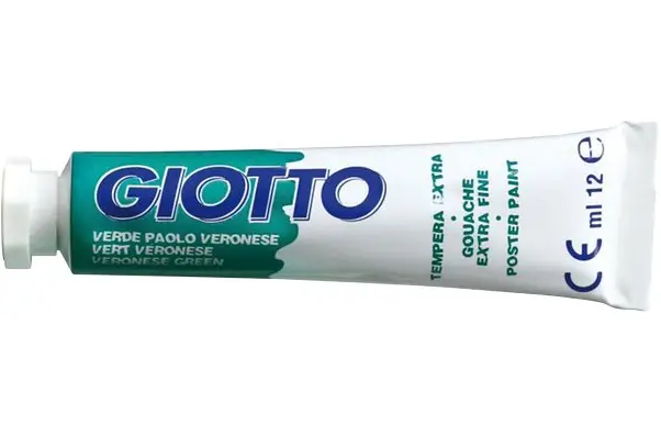
Back in the fall, I bought a tube like the one above for my six-year-old son, who draws (mostly animals and Marvel superheroes) first thing in the morning and first thing when he gets home from school. Leo usually uses markers or crayons and has only used paint a few times. Still, I bought him the Veronese Green because it was such a complex shade to be included among the simple reds, yellows, and blues.
For some reason, I never took the tube of paint out of my pocket. Rather, on walks during the grey days of winter, I would pull out the tube from my pocket to spot-check things that appeared to be the same color.
Here’s a Fiat I spotted in Rome:

Those colors are a close match!
…but where does Venice come into this story?
Paolo Veronese: The Namesake and His Painting Technique

Veronese Green is named after Paolo Caliari (1528-1588), a Verona-born painter who came to be known as Paolo Veronese when he moved east to Venice.
According to Livius’ Notes, the shade of Viridian that would become Veronese Green “was not a colour but a technique.”
From Titian, he had borrowed the technique of tonal variation of the colours, in the order to achieve a soft chiaroscuro and the juxtaposition of complementary colours, to allow these to exalt each other – for example, in some paintings, he matched the Reds to the Greens…
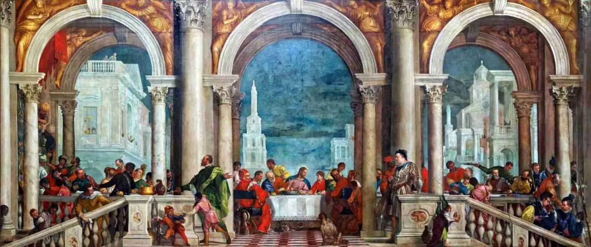
A painting by Veronese where is clearly visible his use of complementary color harmony is the Cena nella Casa di Levi (The Feast in the House of Levi) of 1573. I and my wife saw it last year, visiting the Gallerie dell’Accademia in Venice. It’s a huge painting (5.55 x 12.80 mt), which occupies the whole end wall of a hall. Its visual composition is divided into three vertical bands, highlighted by three round arches, supported by Corinthian capitals. It stands out here the harmony of Reds and Greens, indeed it’s clear that, when Veronese wants to highlight a character dressed in red, stands next to it something green and vice versa.
Livius’ Notes argues that Veronese “had not a preference for the green only but, like all Venetian painters, he used all the available pigments in Venice.”
But I like to think that Veronese was also inspired by the rich greens and aquamarines and emeralds around him in Venice. The constant vision of water, from murky canals to the vast expanse of the lagoon, must have gotten into Paolo’s head as he headed into his studio each day.
Venice: A Colorful Inspiration

I recently went to Venice for a short family vacation and I took along my talisman, my tube of Veronese Green paint. I used it to try to figure out the color’s origin. But I also wanted to hold it up against Veronese works as I encountered them, to see how they matched the color we know today.
Some of the most notable sites** for a Veronese pilgrimage in Venice are:
Walking around Venice also gave me a sense that Veronese, too, had seen these contrasting greens and reds and browns on his daily strolls and gondola rides through the city’s sestieri (quarters).
By the end of day 1, my son and I were playing a game of “I Spy,” pointing out possible candidates for Veronese Green status. My son was also attuned to Veronese’s name as we visited churches (San Pietro di Castello, Zanipolo).
It was an inadvertent, on-the-fly art lesson and a fun way to keep a kid interested when visiting dusty old buildings.
Following are some snapshots of Venice in varying shades of green, most of which are only a few notes off from the blue-greenish hue that made it into Veronese’s paintings:
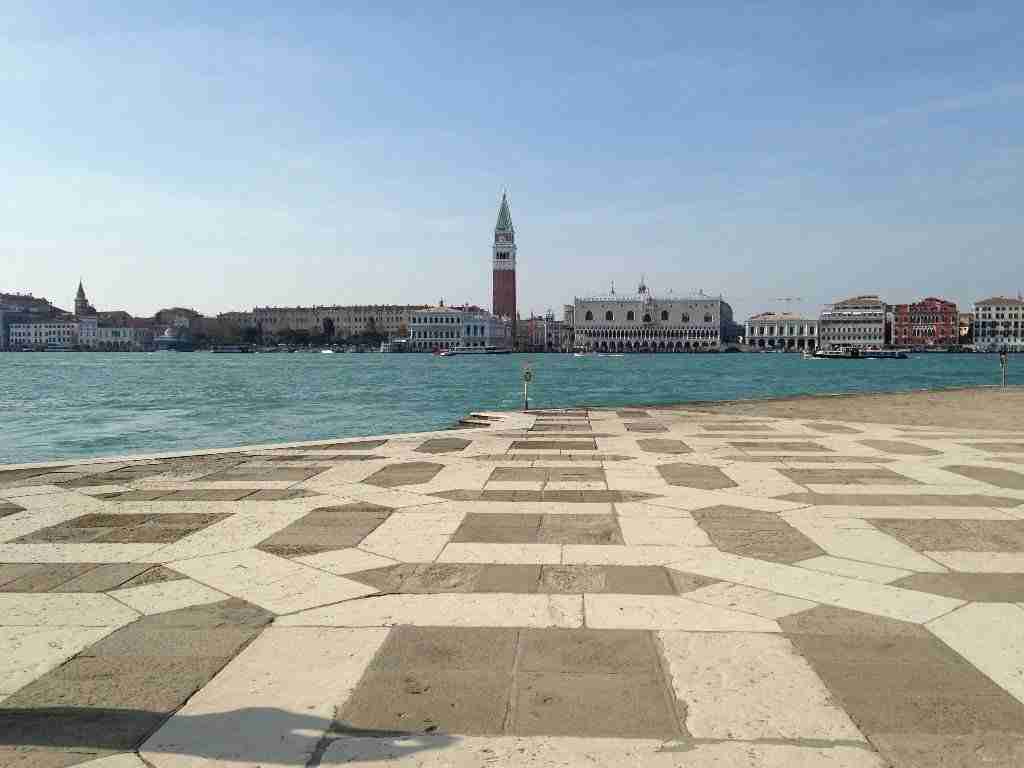
More aquamarine than Veronese Green, the lagoon between San Marco and San Giorgio Maggiore shimmers with a blue-green hue.

The shutters, water, building, and boat all come together to remind one of Veronese’s red/green contrasts.

Can you spot hints of Veronese Green in this shot from Burano?

How Veronese Green was this canal? Very Veronese!
Notes
*Veronese Green’s hexidecimal value is #009B7D, RGB is 0, 155, 125.
**Note that the vast majority of Veronese paintings in Venice are kept in museums and churches that do not allow photography.

This month’s topic for the Italy Roundtable was “green.” Here are the posts from my participating colleagues. Enjoy!
- Jessica – Green Travel in Italy
- Gloria – Nel verde degli anni
- Alexandra – 11 green vegetables I never ate before moving to Italy
- Michelle – The Inspiring Legacy of Nicholas Green
Updated February 28th, 2026
Originally published April 22, 2015